
Website clarity
The 10 Second Website Test: Can Visitors Tell What You Do?
Use three simple questions to see whether a new visitor can quickly understand what your business does, who it helps, and what to do next.
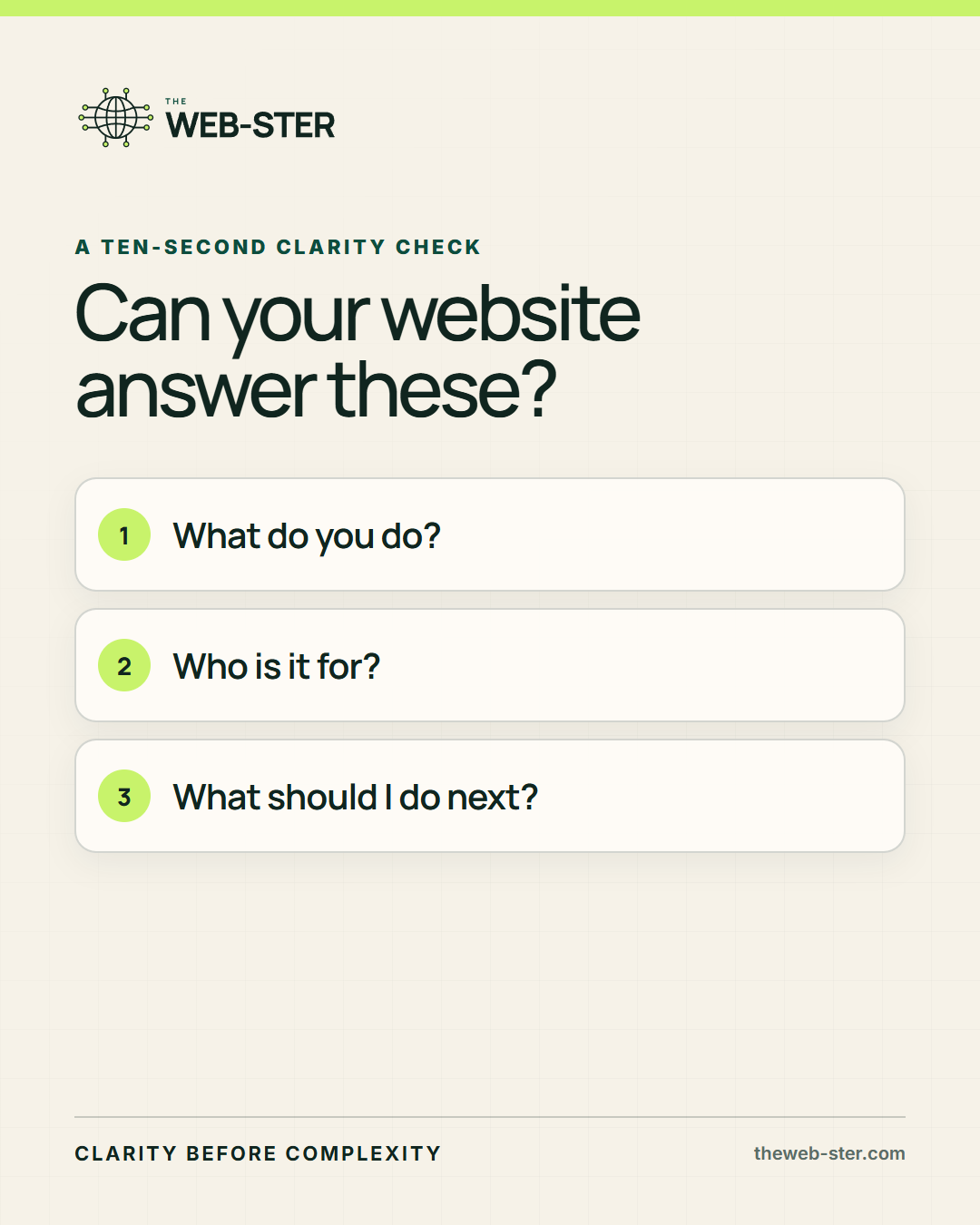
Your website does not need to explain the entire business in 10 seconds.
It does need to give a new visitor enough clarity to decide whether to stay. If the first screen makes people translate a slogan, hunt for the service, or guess which button matters, the website is spending attention it has not earned yet.
That can happen on a beautiful website. In fact, polished design sometimes makes the problem harder for the business owner to notice because the page feels finished even when the message is not.
The three questions every first screen should answer
What do you do?
A stranger should be able to name the recognizable service, solution, or category without translating an abstract promise.
Who is it for?
The right visitor should recognize the audience, situation, need, or problem quickly enough to feel that the page belongs to them.
What should I do next?
One primary action should make the next decision obvious. Other paths may exist, but they should not all compete with equal weight.
A polished website can still make people guess
Strong photography, animation, modern colors, and complete navigation can create a positive first impression. They cannot replace an understandable offer.
The problem is not always missing information. Often, the answer exists somewhere on the page but does not appear in the order a new visitor needs it. The business knows how the pieces fit together. The visitor does not have that advantage.
Clarity is not about making every website plain or identical. It is about making the visual and verbal priorities support the decision instead of competing with it.
Question one: What do you do?
A slogan can express a belief or a desired outcome. It rarely carries the whole explanation by itself. If the headline is broad, place a recognizable service or category close enough that the visitor does not have to decode it.
Imagine a headline that says, Make what comes next possible. It may sound confident, but it could belong to a bank, a school, a software company, or a consultant. A short supporting line that names the actual work gives the promise somewhere to land.
The goal is not to cram every capability into the headline. It is to give the visitor one accurate frame for understanding the rest of the page.
Question two: Who is it for?
People pay closer attention when they recognize their situation. That signal may come from a named audience, a specific problem, a business model, or an outcome that feels unusually relevant.
Broad phrases such as everyone, organizations, or innovative leaders often avoid excluding anyone, but they also make it harder for the right person to feel seen. Useful audience language should help someone identify fit without pretending the service works only for one narrow group.
The Web-ster, for example, can name businesses, churches, and community organizations while still explaining that the work adapts to local, online, nonprofit, and national models.
Question three: What should I do next?
A visitor should not have to compare five equally loud buttons before taking the first step. The primary action should match how ready that person is likely to be.
Someone arriving through a referral may be ready to explain a project. Someone discovering the business for the first time may prefer a useful guide, work example, or service explanation. A strong first screen can support both paths while making one clearly primary.
The wording matters too. A button such as Submit gives the visitor no reason to care. A specific action such as Tell Richard what you need explains what happens and lowers the pressure to arrive with a finished brief.
Five signs the first screen is failing
The headline could belong to almost any business
The promise sounds positive but provides no useful category, customer, or problem context.
The service appears only after scrolling
A new visitor must invest attention before learning whether the business offers what they need.
The audience is implied but never recognizable
The page expects people to identify themselves from language so broad that nobody feels specifically addressed.
Several buttons compete without a clear priority
The page offers choices, but it does not guide the first decision.
Someone familiar with the business has to explain it
The website depends on knowledge the new visitor does not have.
Run the test without grading your own homework
Show only the first screen to someone who does not already know the business. Ask what the company does, who it appears to help, and what action seems most important. Then listen to the words they use instead of explaining the answer.
Try it on a phone as well as a larger screen. Mobile layouts can push the explanation or primary action farther down, even when the desktop version feels clear.
One person's response is not a complete conversion study, but hesitation and guessing are useful signals. They show where business familiarity may be hiding customer effort.
Clarity is the starting line, not the whole race
Passing this test does not prove that the website has strong proof, accessible design, useful content, dependable performance, search visibility, or a good follow up process. It confirms something more basic: the visitor has a reason and a path to continue.
That foundation matters because more traffic does not repair a confusing offer. It simply gives more people the opportunity to leave confused.
Once the first screen is clear, the rest of the website can do the deeper work of answering questions, building trust, showing evidence, and helping the visitor make a confident decision.
Published August 26, 2026. Last reviewed August 26, 2026.